Payne’s Gray Watercolor: Limited Palette Portrait
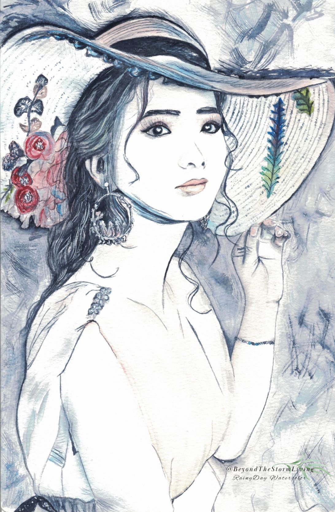
I just finished a new piece that felt really different to work on. I put away my usual colors and painted almost entirely with Payne’s Gray.
It’s a study of light and suggestion. I imagined an overexposed photo—where the light washes over the form, leaving just hints of detail and some graceful lines to tell the story. Using a severely limited palette like this forces you to see shape and mood in a whole new way.
Credit: Original work.
💡 Helpful Guides:
→ Limited Palette Guide
Materials Used:
📌 Disclosure: The post contains affiliate links. As an Amazon Associate, I earn from qualifying purchases.
- Paper: → Baohong Cold Press Paper Cotton Block – great affordable paper
- Brushes: Princeton Heritage Brushes – excellent control and precision
- Paints: Rosa Gallery pan set – vibrant affordable professional colors
#Watercolor #LimitedPalette #PaynesGray #Overexposed #ArtStudy #WatercolorPortrait #MinimalArt #ArtBlog